Galeeva Alina

Hello! I am a 3rd year design student. I develop graphics of varying complexity, create websites and design different media. I believe that the design should correspond to the task and help the business.


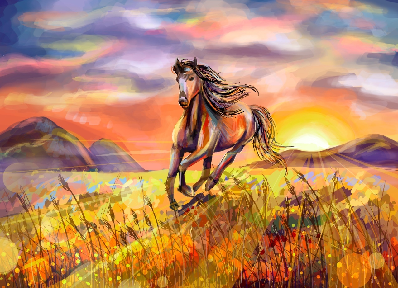
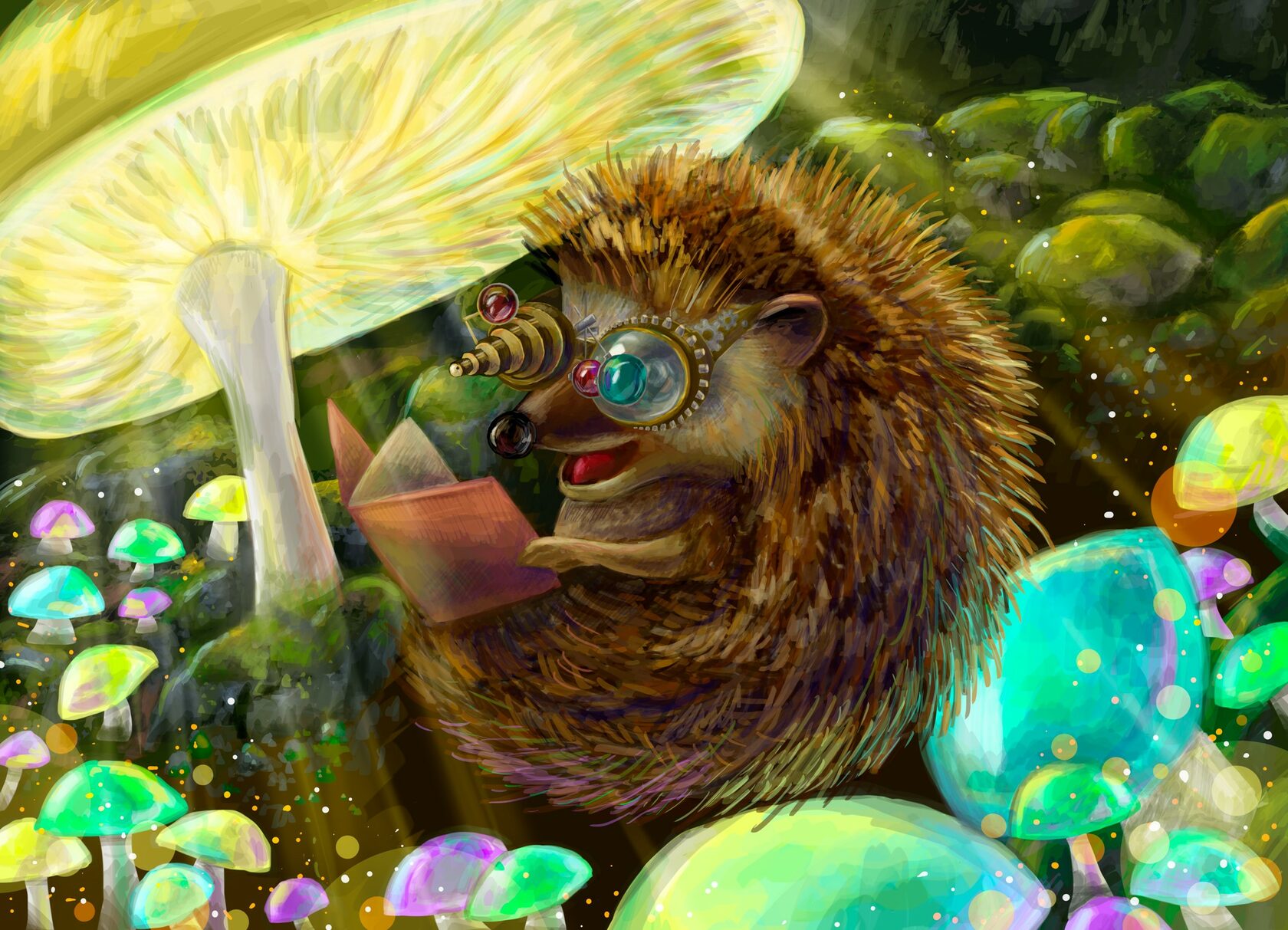
Promotional postcard
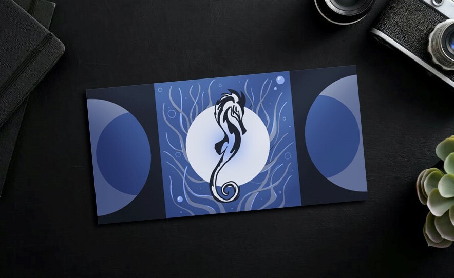
In the presented project, a series of postcards dedicated to the theme "Primorsky Oceanarium" is being developed. Postcards are promotional messages and announcements for upcoming performances. In total, there are 4 postcards in the series, and each of them symbolizes
a certain time of the year and shows one animal – the "star of the program", whose performances, screenings and exhibitions viewers can count on during this period. Not only a graphic, but also a constructive solution has been developed - there are 3 different transformations.
a certain time of the year and shows one animal – the "star of the program", whose performances, screenings and exhibitions viewers can count on during this period. Not only a graphic, but also a constructive solution has been developed - there are 3 different transformations.

Read more
Projects from the university
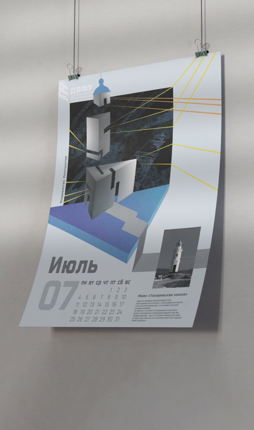
Development of graphics for the calendar. The author's idea is an extraordinary presentation of the sights of the city through various geometric shapes. Rough lines and muted tones, an abundance of straight lines and clarity of rhythms set a certain character of this graphic series. All this reflects the life of such a bright city as Vladivostok.
Calendar

Read more
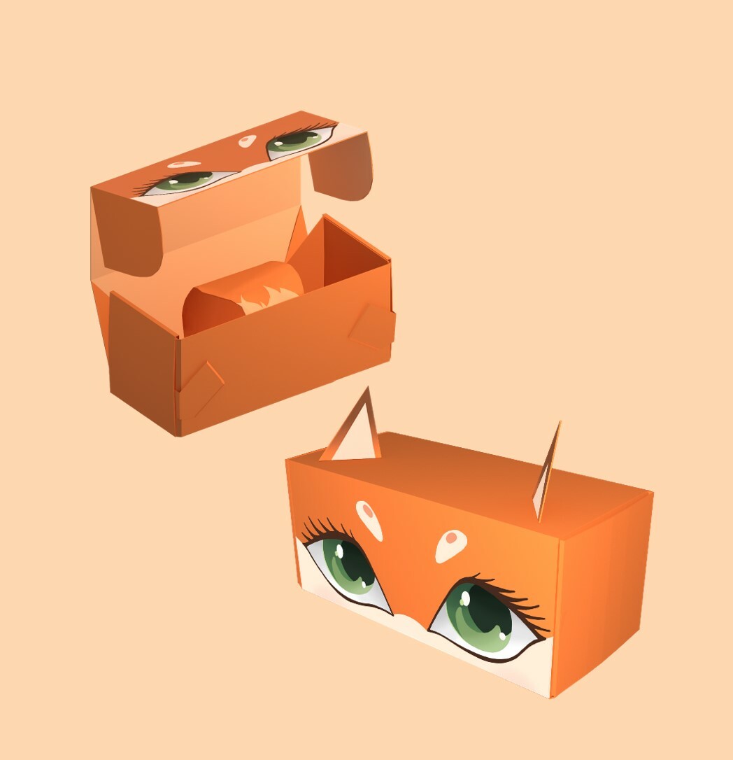
The consumer packaging of the Christmas tree toy developed within the framework of the project ensures the original performance of the storage function. Together with the elements of transformation, packaging becomes an integral part of the holiday, as it itself becomes a decorative element, an additional christmas tree toy, a pleasant gift and an addition to the main product.
Packaging
Read more
Brochure
The brochure "Design. Trends and personalities" includes 48 pages of full-color printing. The compositional design is revealed through functional, visual and aesthetic integrity, organic forms, construction and material. The 12-column set allows you to strictly maintain the rhythm and dynamics, which increases the artistic expressiveness of the design object. The brochure is of an advertising and educational nature and combines the signs of laconic minimalism and experimental asymmetry.
Read more
Brand Identity
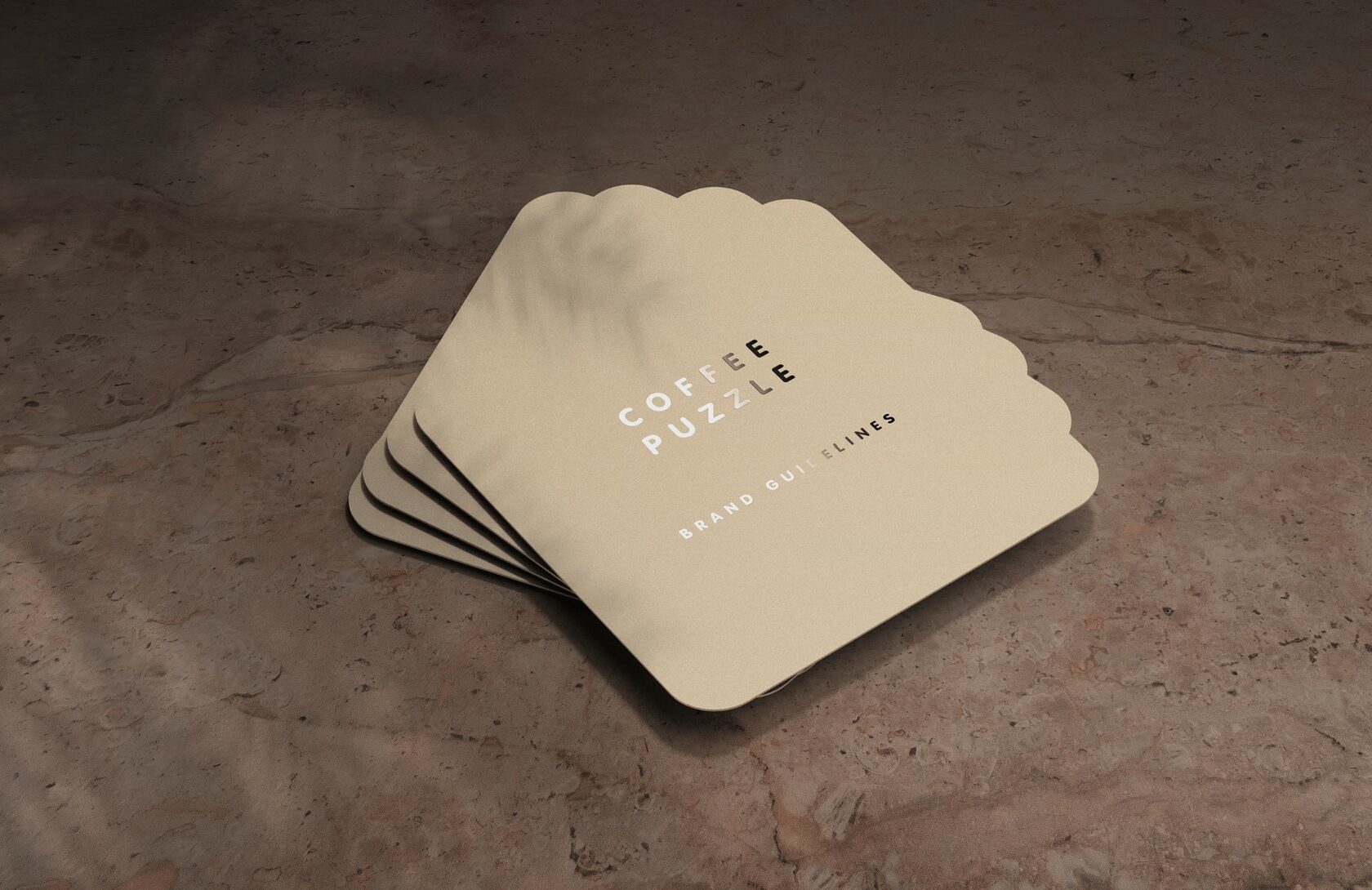
Coffee puzzle - a company engaged in the manufacture of curly wooden puzzles as a gift. The aesthetics of the brand are natural colors, craftiness, a sense of comfort.
The package will contain coffee beans and marshmallows. So, this smell was the inspiration for the logo design of the brand.
Slogan: "We don't give puzzles, but a mood."
Core values: cutting quality and materials, environmental friendliness, naturalness.
The package will contain coffee beans and marshmallows. So, this smell was the inspiration for the logo design of the brand.
Slogan: "We don't give puzzles, but a mood."
Core values: cutting quality and materials, environmental friendliness, naturalness.
Read more
Graphic Design (Branding)
Rebranding
Read more
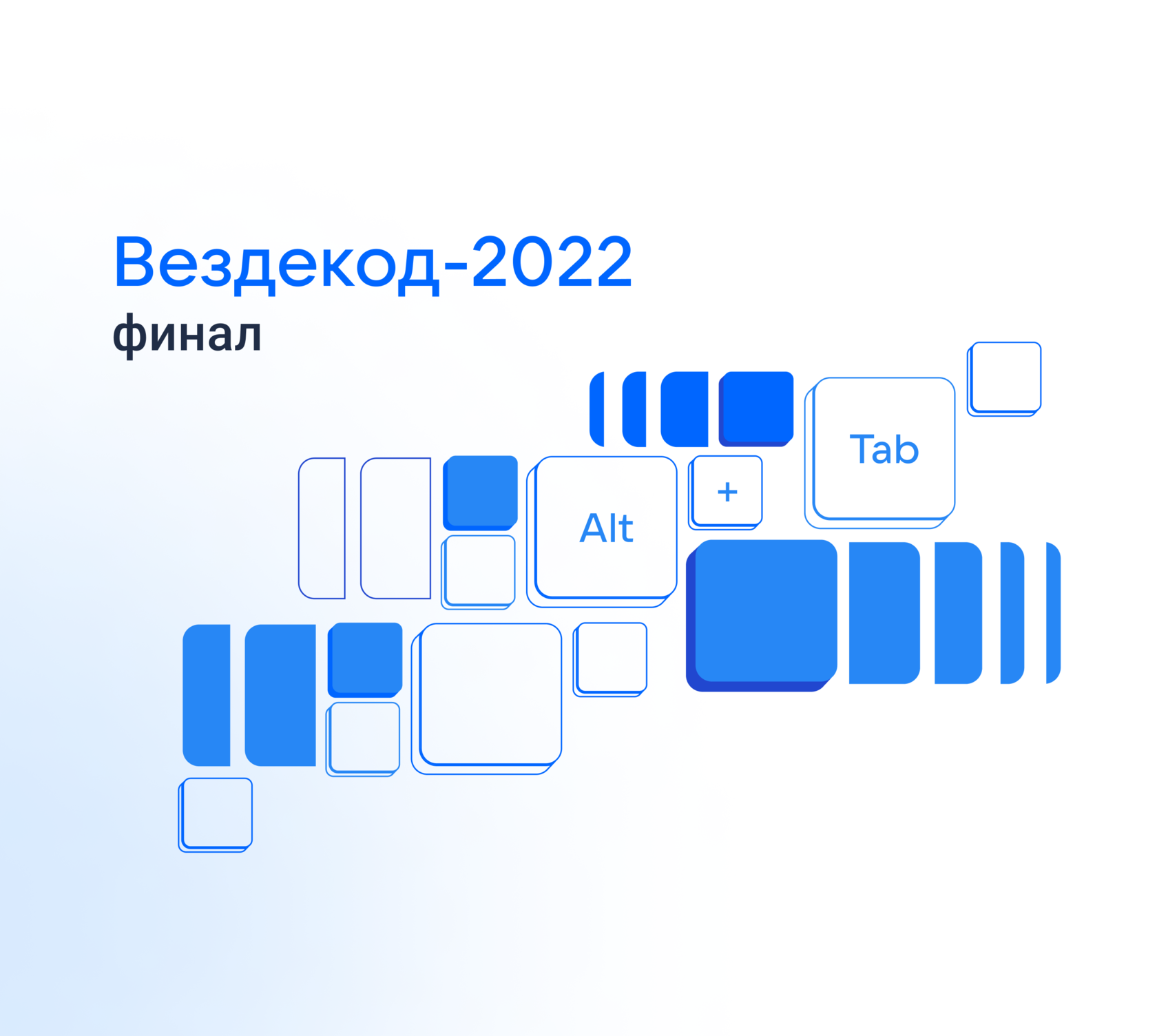
“Vezdecode-2022” is Programming Marathon - bright, interesting and, undoubtedly, stressful event. Therefore, the task of the new design is to show the energy of the participants, the complexity of the tasks and the professionalism of the organization
of such a large-scale event, as well
as to indicate a close connection with the IT sphere.
of such a large-scale event, as well
as to indicate a close connection with the IT sphere.
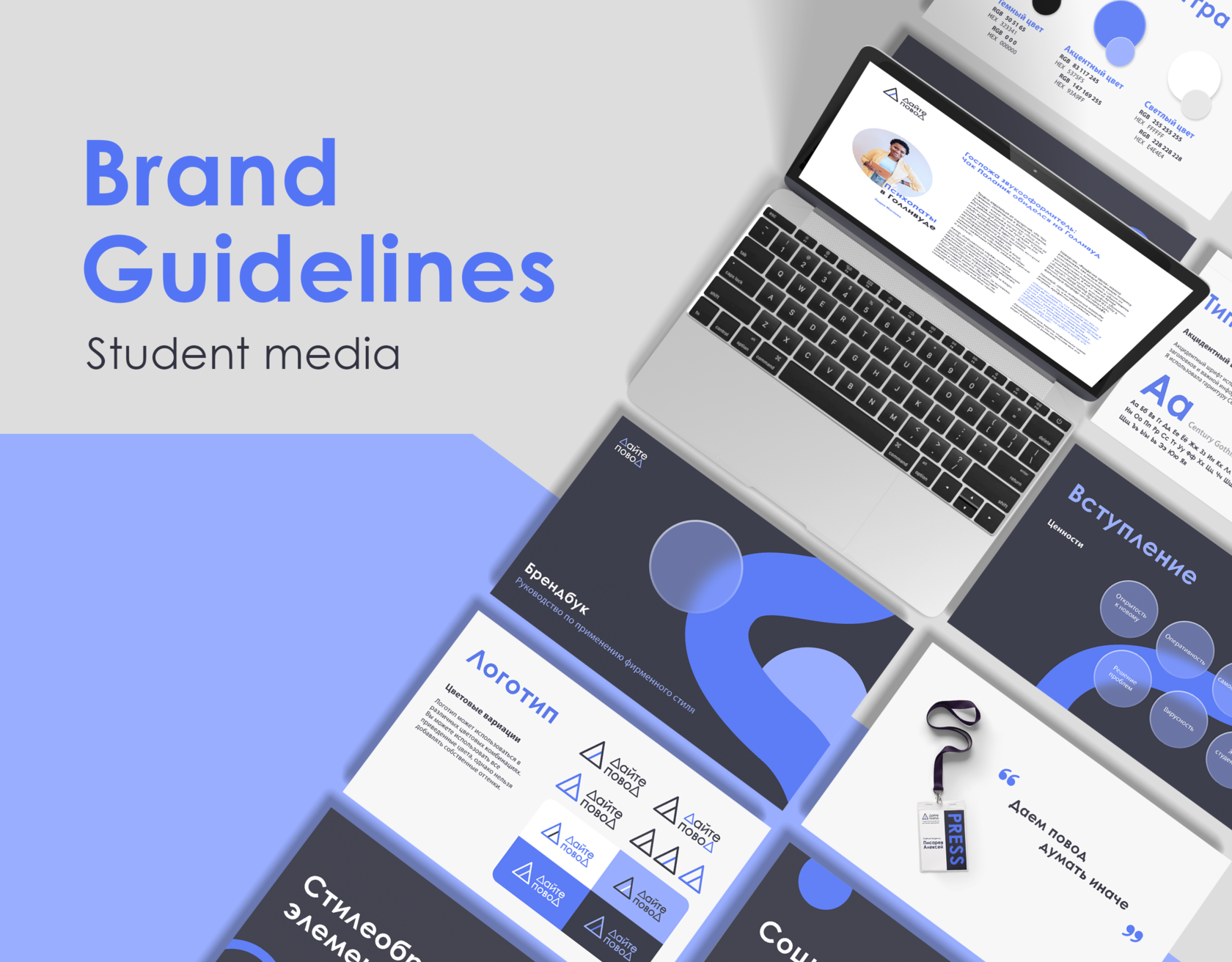
The corporate identity of the student media brand “Give a reason” is formed due to many components. The following pages will help you understand how
to organize the entire subsequent design of the organization in the best way in accordance with
its goals. "Give a Reason" is the first student mass media in the Far East, focused exclusively on young people and students of the Far East.
to organize the entire subsequent design of the organization in the best way in accordance with
its goals. "Give a Reason" is the first student mass media in the Far East, focused exclusively on young people and students of the Far East.

Read more
Brand guideline
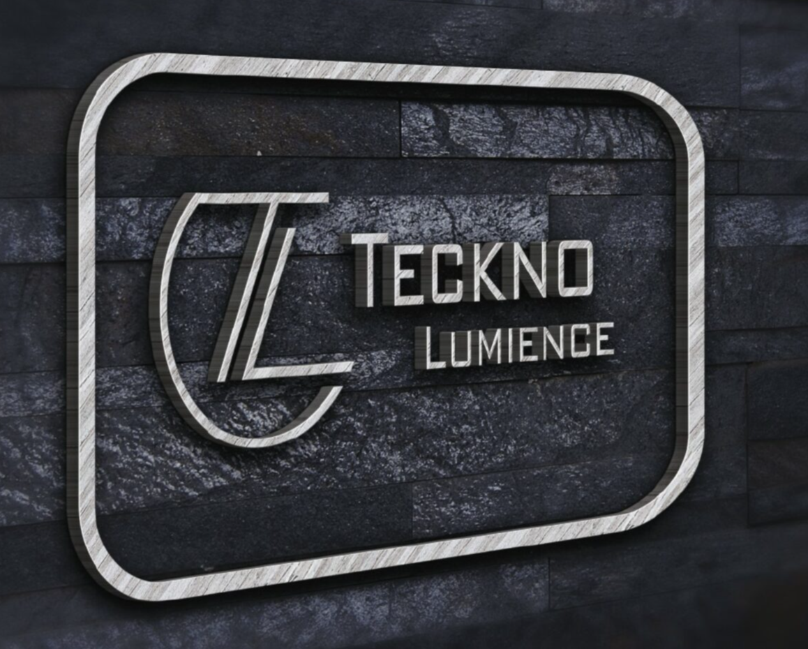
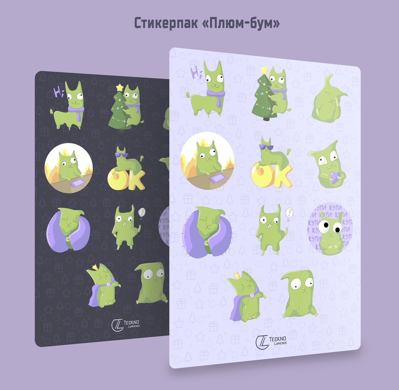
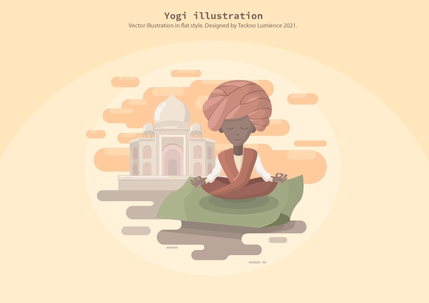
Teckno Luminance is a mini design studio.
The main values are technological - working in a digital environment, customer-oriented - ease and speed of execution, multitasking - working in different areas of design. We have created a distinctive logo based on smooth and sharp lines. We have developed a series of patterns for various types of packaging and advertising. We have developed a memorable corporate identity. This style will distinguish the company from competitors and attract the attention of customers.
The main values are technological - working in a digital environment, customer-oriented - ease and speed of execution, multitasking - working in different areas of design. We have created a distinctive logo based on smooth and sharp lines. We have developed a series of patterns for various types of packaging and advertising. We have developed a memorable corporate identity. This style will distinguish the company from competitors and attract the attention of customers.
Read more
Corporate identity
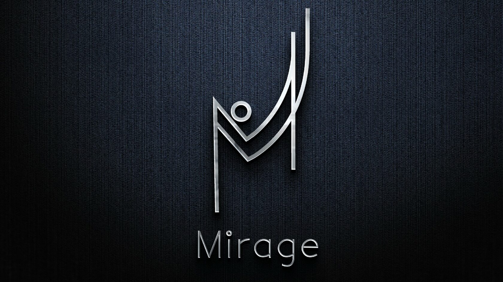
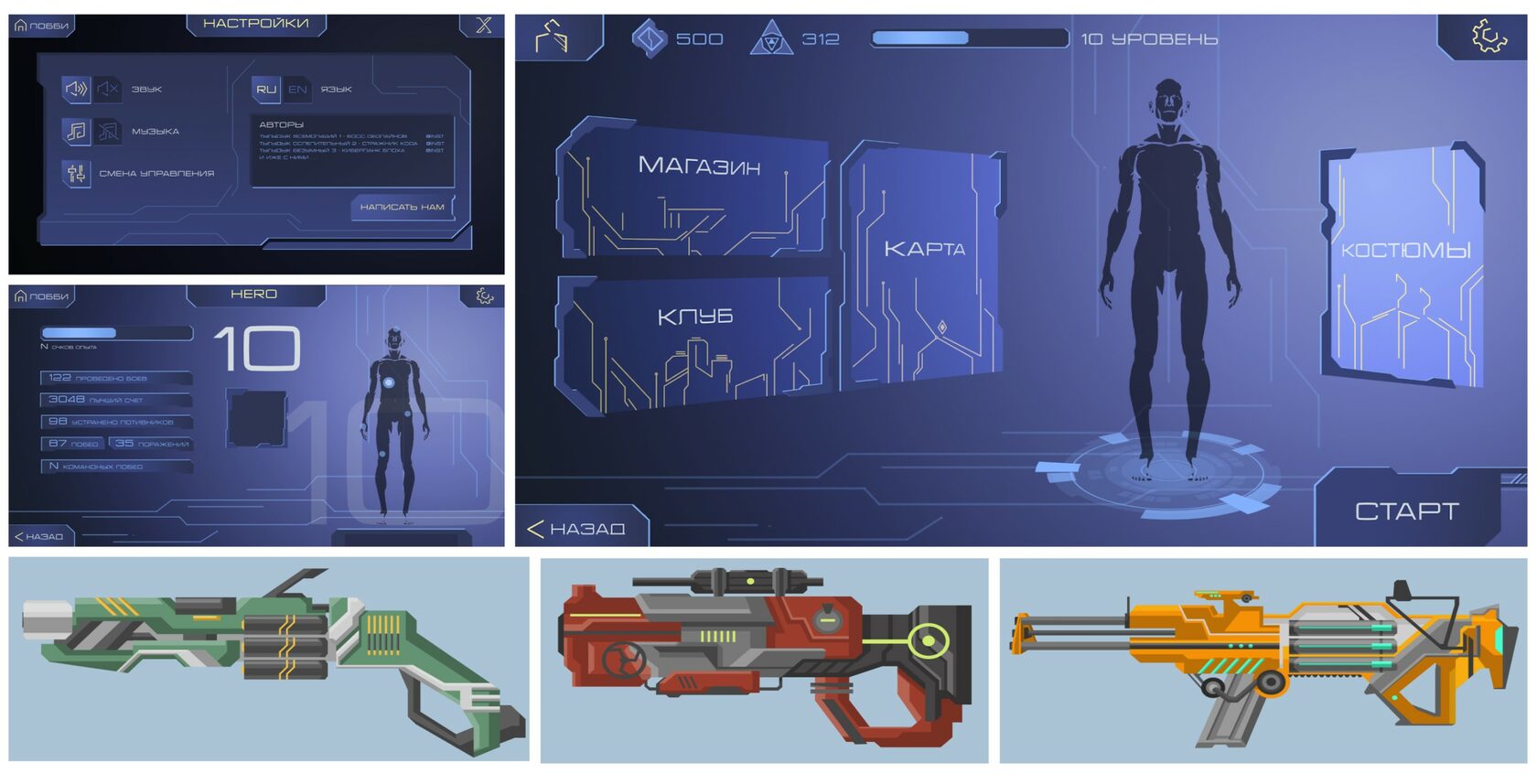
Mirage is an international studio for the development of AR/VR/XR products. Core values: technology - creating interactive solutions of any complexity, dynamism - increasing sales and reaching the client's audience, modernity - using advanced technologies in the development of games and other VR products.
Read more
Logo Design
Landing Page
Read more
UI/UX-Design
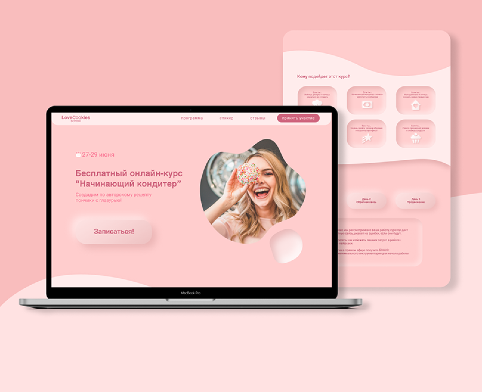

Design of Landing Page for a free online course on confectionery. Colors and shapes should be gentle and smooth, airy. Landing Page is made in pink, pale shades to give a feeling of lightness. The neomorphism effect is designed to emphasize the simplicity and relevance of the course.
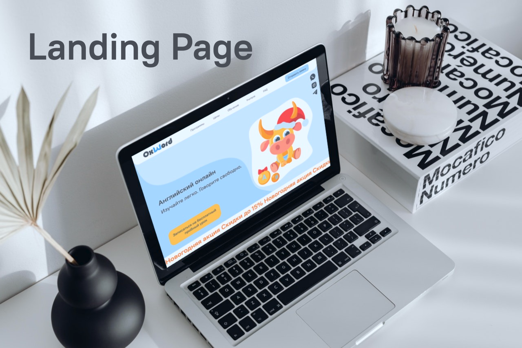
The task was to create a landing page and corporate identity elements for an online English language school for the junior preschool level and to prepare for exams. The main CTA is to purchase the first lesson before the New Year's sale.
Landing Page
Read more
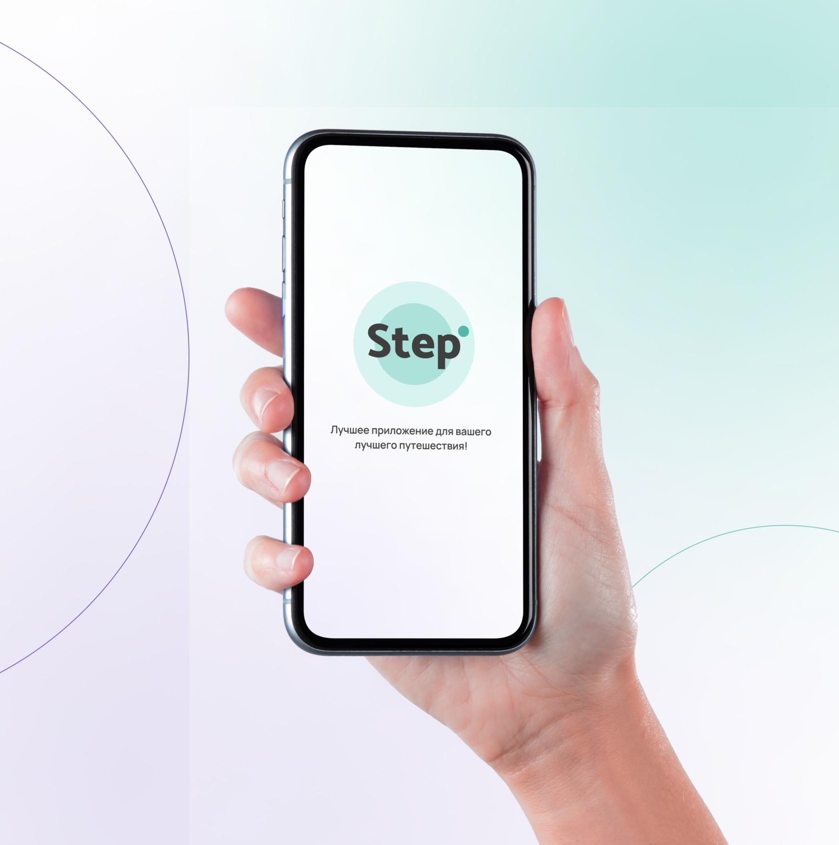
"Step" is an application with unique tourist routes that explores the preferences and capabilities of each user and offers the most optimal travel option. The routes are completed in the format of a game with bonuses and gifts from partner companies.
App development
Read more
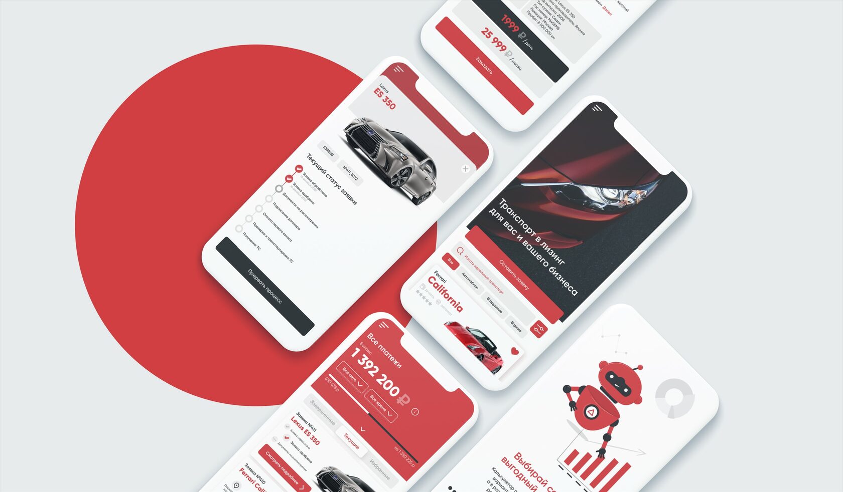
An application for leasing any type of vehicle with an intuitive interface. A catalog and filtering of all vehicles was made, about forty cards for the application were modeled, more flexible configuration and advanced functionality for some types of vehicles were thought out, a support chat with a smart chatbot and tips was made, a screen for calculating the profitability of leasing and a menu of all orders was made, familiarization screens were redesigned.
Strict elegance, honesty, speed of service and reliability are the main values of this company.
Strict elegance, honesty, speed of service and reliability are the main values of this company.
App design
Read more
Web-site
Read more
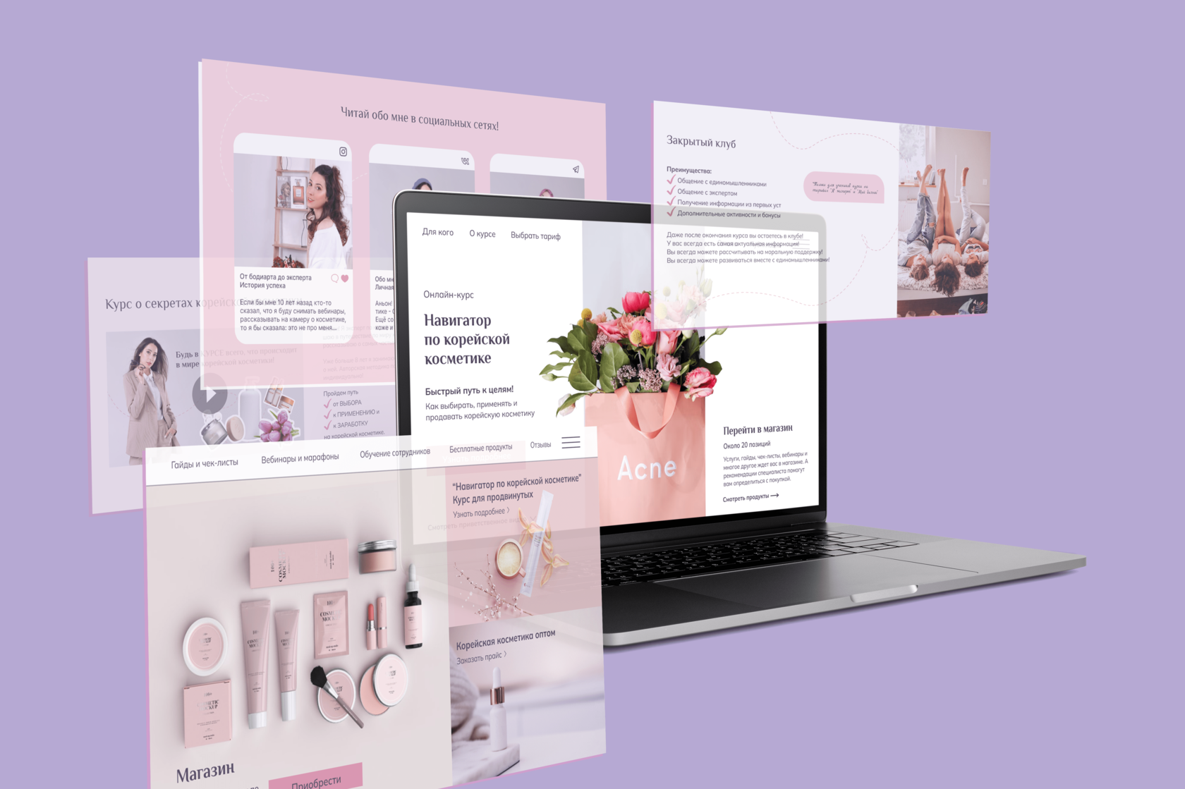
A multi-page website for products and services about Korean cosmetics. The task was to attract customers to the page, introduce customers to the expert, sell the basic course, and familiarize them with other services and products. The design is made with all the wishes of the customer - a romantic classic, gentle and light, for true ladies and connoisseurs of beauty.
Artworks

Thanks for watching! If you have any questions or suggestions, write to me by email or on social networks: