Brochure
Design. Trends and personalities.
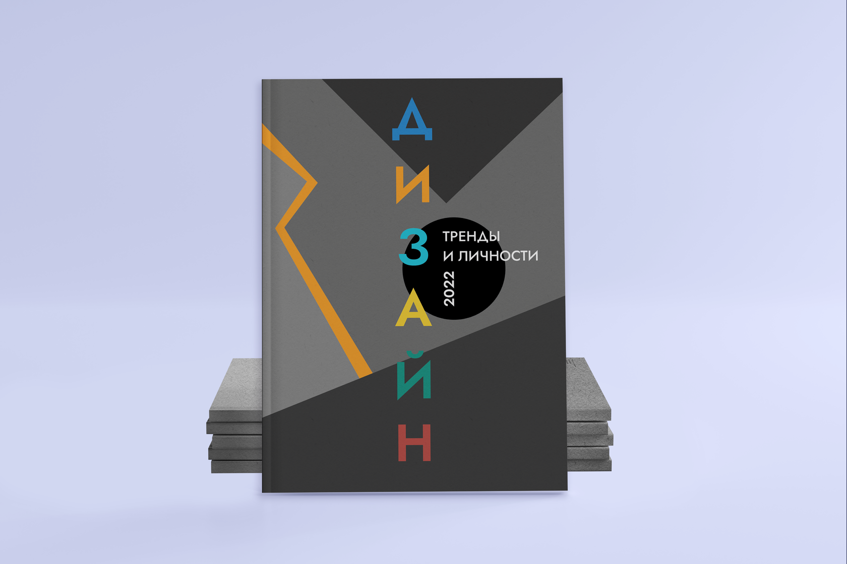
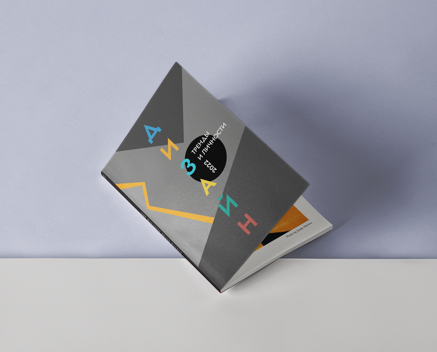
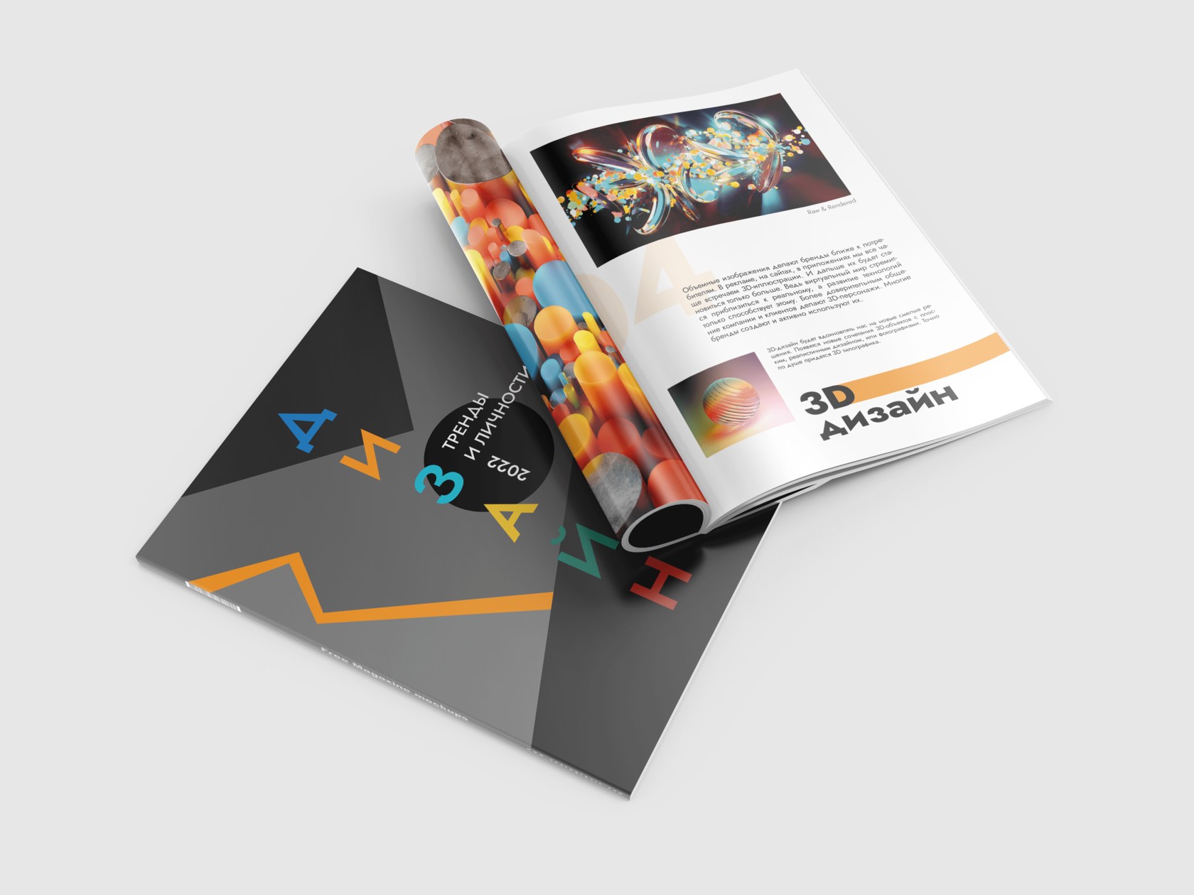
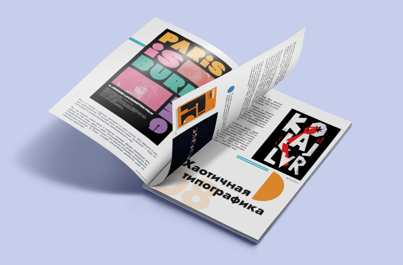
When building the brochure concept, we limited the scope of the metaphor search to certain criteria. The first criterion is impression. The impression had to be bright to match the informal style, concise to increase the fluency of perception of information, premium – so that the consumer felt special and wanted to dive deeper into the world of design. We chose geometrization and emphasized chaotic minimalism.
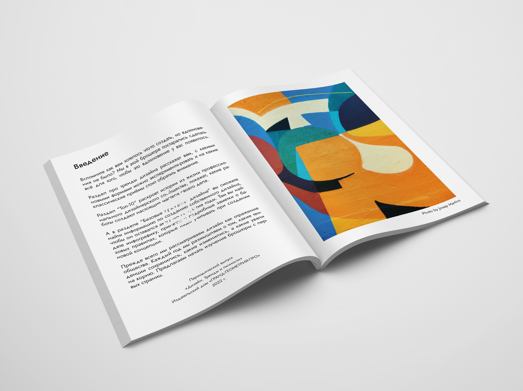
The photograph taken by Joseph Martin served as a starting point, a kind of palette of the brochure and set its general mood and tone. The chosen color combinations in meaning and texture best suited the concept of a brochure with such diverse content.
The photograph taken by Joseph Martin served as a starting point, a kind of palette of the brochure and set its general mood and tone. The chosen color combinations in meaning and texture best suited the concept of a brochure with such diverse content.
Concept
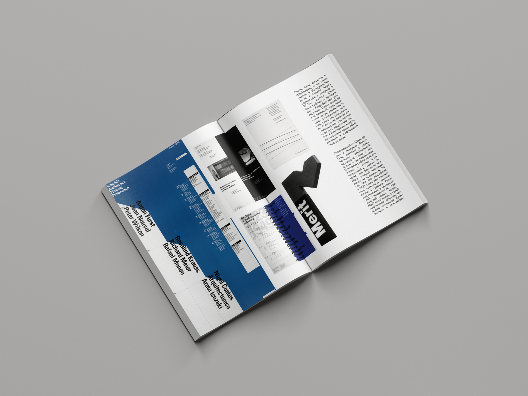
The typography of this brochure fully corresponds to its format, semantic content and design concept. Laconic and brisk, she keeps the grid strictly, but has her own rhythm. The selected Jost font emphasizes the premium quality of the publication, its solidity, rigor, and creativity.
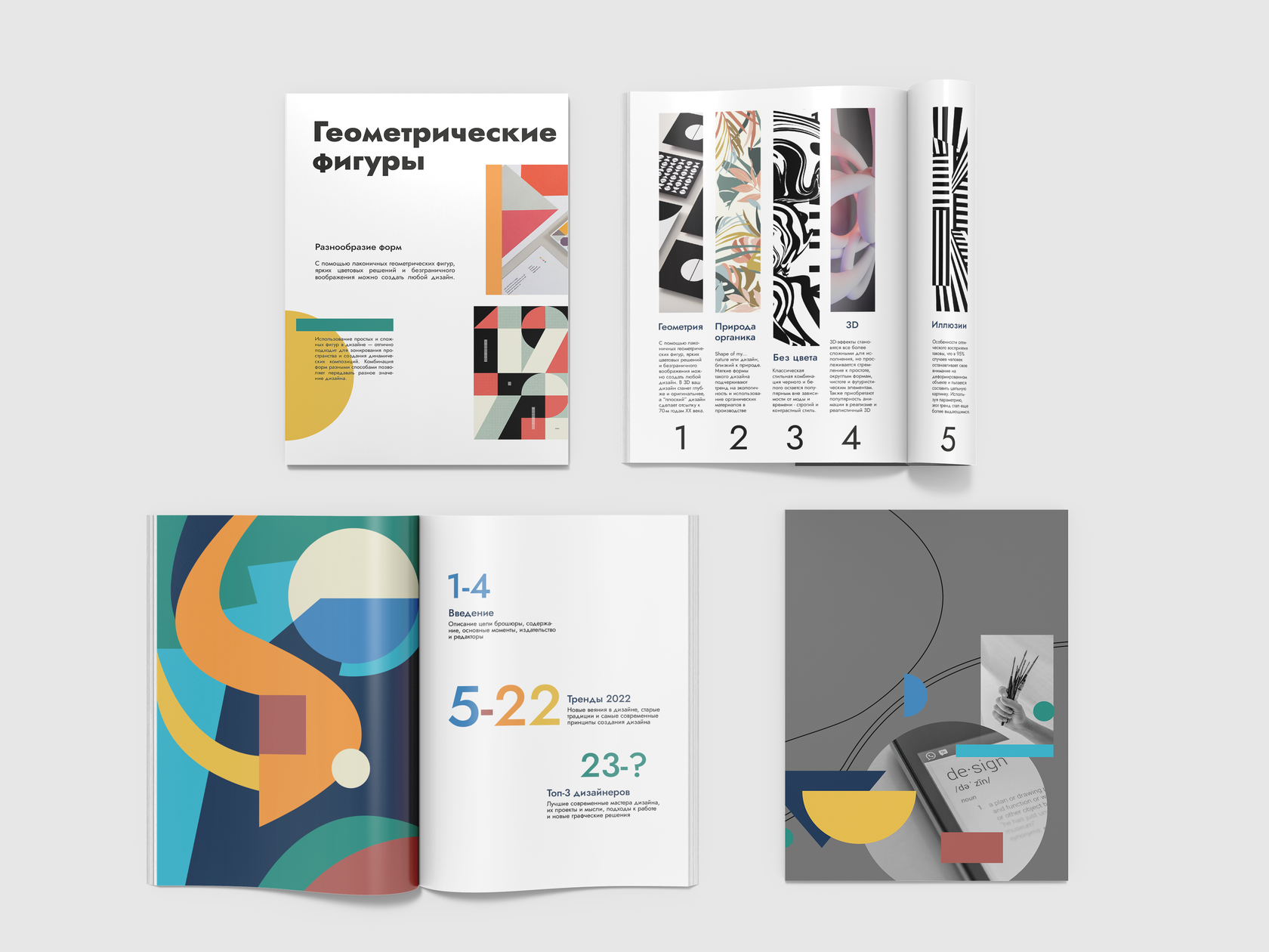
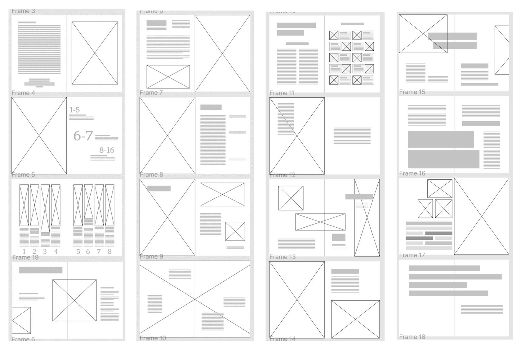
The specifics of the preparation of the brochure is that all the elements of the advertising structure are created in parallel as equal components of a single whole. A professionally executed advertising or educational message cannot fail to take into account the laws of perception psychology. Economic and psychological efficiency are interrelated - the active impact of information on the consciousness of a potential consumer, as a rule, increases the effectiveness of the information absorption process.
Prototype
View all the spreads of the brochure
View all the spreads of the brochure
