Promotional postcard
Image transformation through shape transformation
In the modern world, there are many ways of communication – we can easily congratulate a person by calling, writing him an email or a message on any social network. However, there are also traditional methods that remain relevant and in demand in our world. One of these methods is an open letter. The world is changing, but traditions remain, so we still receive and give paper postcards for the holiday. The task of designers is to preserve these traditions and transform them into the modern world.
Our open letter is primarily a marketing ploy to attract consumers. The presented postcard is of an advertising genre and constantly reminds users about the object of advertising, even after being used for its intended purpose.
Therefore, our postcard can meet the wishes of several groups of consumers at once. So, it can be useful to potential clients of the Aquarium as an easy way to get acquainted with the entertainment program. Also, the postcard can be useful to the guests of the Aquarium – with its help they can choose a suitable bus route and easily get there by following the prompts on the map. The postcard may also be of interest to collectors, as the series will consist of four different postcards. And ordinary visitors after a walk around the Aquarium can transform a postcard into a colorful mini-poster – so, it can fit as a decorative decoration of the space. Later, any consumer can use a postcard as a phone stand – this category of consumers is the most extensive.
Therefore, our postcard can meet the wishes of several groups of consumers at once. So, it can be useful to potential clients of the Aquarium as an easy way to get acquainted with the entertainment program. Also, the postcard can be useful to the guests of the Aquarium – with its help they can choose a suitable bus route and easily get there by following the prompts on the map. The postcard may also be of interest to collectors, as the series will consist of four different postcards. And ordinary visitors after a walk around the Aquarium can transform a postcard into a colorful mini-poster – so, it can fit as a decorative decoration of the space. Later, any consumer can use a postcard as a phone stand – this category of consumers is the most extensive.
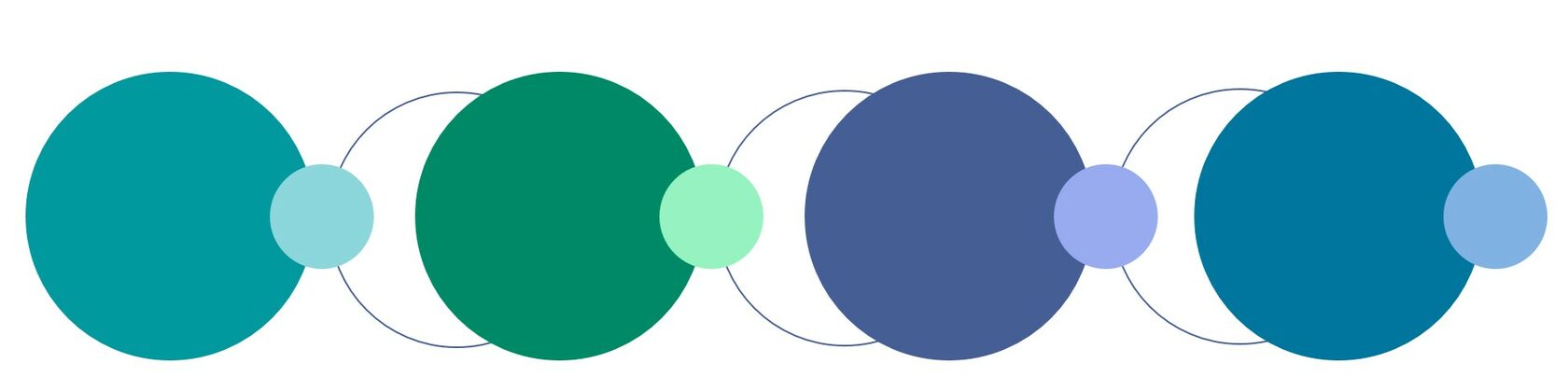
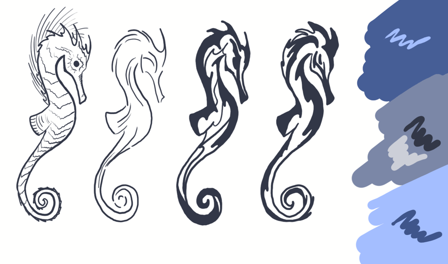
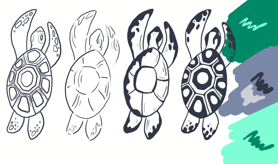
This choice is not accidental – in the series we offer a certain color key, where each color is associated with a marine theme, the time of year and a certain animal – with its habitat or activity. For example, the bluish-blue northern waters, in which the seal lives, are beautiful in spring – it is at this time of the year that the animals come ashore. The bluish-green waters of warm seas are full of green sea turtles in summer – this is the time for their reproduction. In the bluish-purple depths of the ocean, you can meet seahorses. And in the blue tropical waters – to see dangerous sea wasps. The color scheme is designed in the same style and palette. All elements are introduced in conjunction with others – be it graphic details, color or stylized images of animals.
At the same time, in the primary, closed form, we can only notice the main gray corporate colors. In all four postcards of the series, initially only one neutral graphic and abstract elements are visible. But with the disclosure and further manipulations, an idea begins to manifest itself in each such postcard, a symbol is formed, new compositions are formed from abstract elements. And even with incomplete transformation, when the postcard becomes 3D, the user can see the habitat of this animal and, accordingly, its inherent color.
At the same time, in the primary, closed form, we can only notice the main gray corporate colors. In all four postcards of the series, initially only one neutral graphic and abstract elements are visible. But with the disclosure and further manipulations, an idea begins to manifest itself in each such postcard, a symbol is formed, new compositions are formed from abstract elements. And even with incomplete transformation, when the postcard becomes 3D, the user can see the habitat of this animal and, accordingly, its inherent color.
Each postcard from the series is mobile and can change its functionality depending on the manipulations performed on it. We have developed 3 variants of manipulations that are associated with the performance of certain functions. So, for some transformations, we offer an advertising booklet with an announcement of the event, for others – a kind of guide and a source of information, and for others – a colorful poster that can be used for decorative decoration of the room space. Also, with some transformations, a postcard can turn into a kind of phone stand or holder.
In this postcard I used certain means of graphic language. One of them is the stylization of elements. I put a certain meaning into all the elements of the postcard. Therefore, so that this meaning is not lost, I simplified all the details. So, the postcard uses a minimum number of colors (5) and simple shapes. The style of the images was chosen simple, the fill is solid, the lines are smooth, stringy – suitable for the theme of the sea.
Relevance
The concept of the postcard series project
Choosing a graphic language
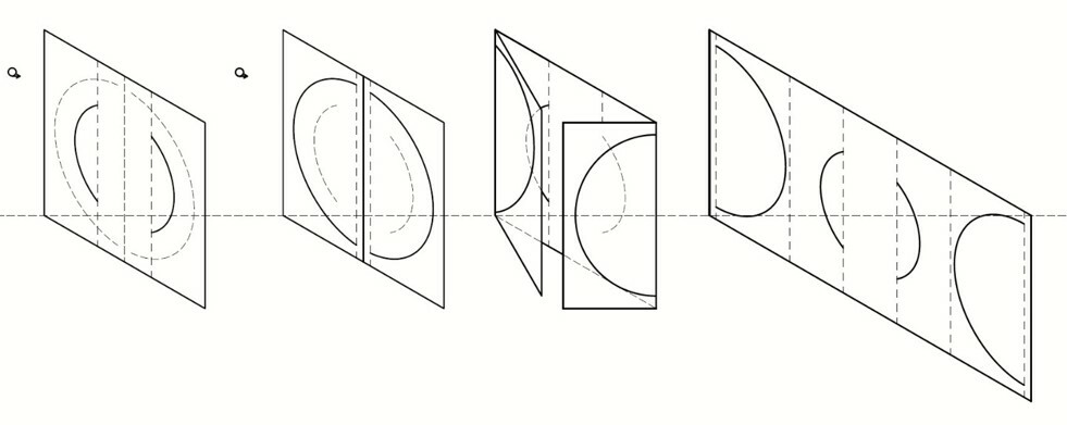
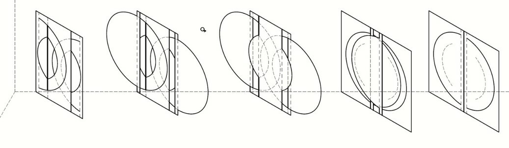
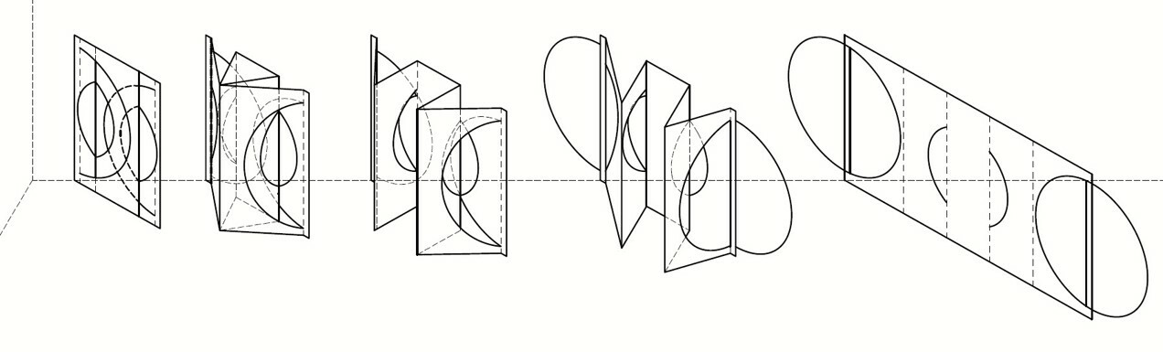
During the transformation, not only graphic meanings change, but also functional ones. What was insignificant becomes significant and vice versa. The transformation of the image through the transformation of the form occurs through a series of manipulations with the design of the postcard.
Computer graphics was chosen as the technique of execution, as this is the most vivid and modern way of performing graphics.
It most accurately conveys the feeling of the theme of the sea – smooth curves and complex shades of colors of the depths of the sea. However, there is an option in the traditional gouache execution.
It most accurately conveys the feeling of the theme of the sea – smooth curves and complex shades of colors of the depths of the sea. However, there is an option in the traditional gouache execution.
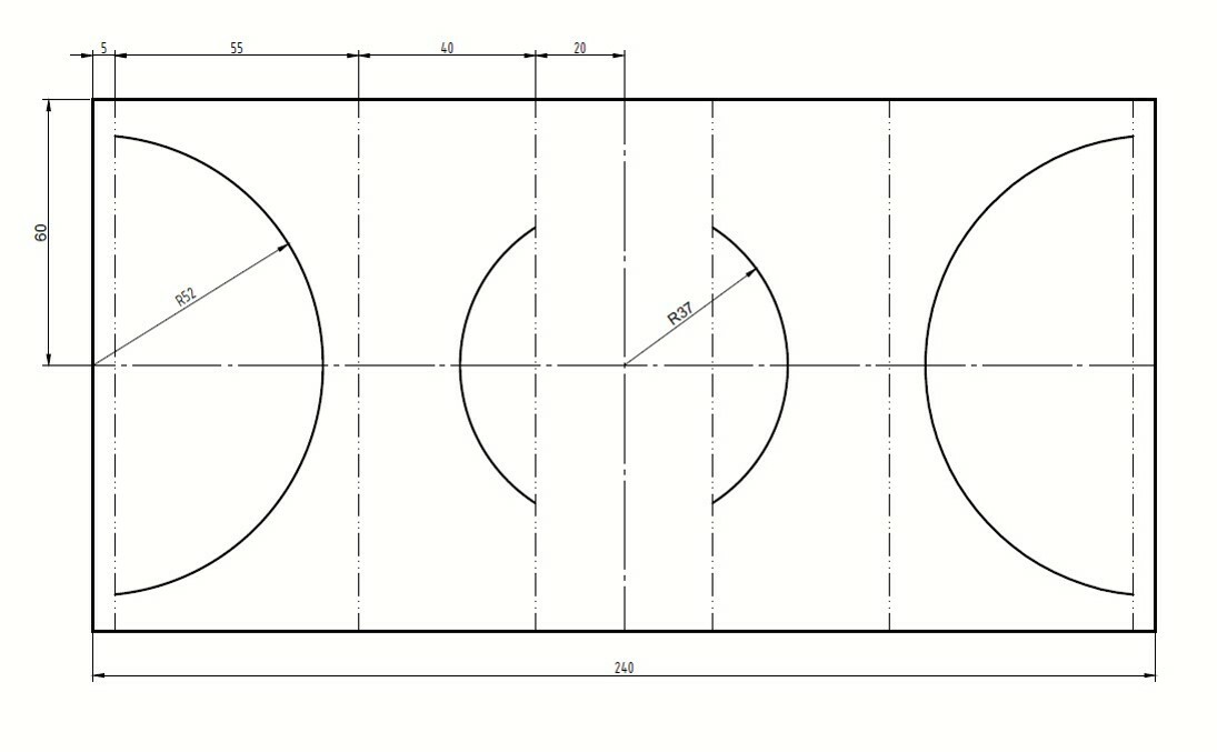
The plastic solution combines sharp and smooth elements. The shapes of the postcard are symmetrical, subordinated to a single style, which is based on such a geometric figure as a circle. Arcs of different diameters and fancy bends of a rectangular sheet give the effect of a multi-layered image, the lightness of the composition.
The main font of the text – Gochi Hand Cyrillic – was chosen for its softness, smoothness, which corresponds to the theme of the sea. This font is made for "handwritten", so it fits perfectly into a postcard – after all, all the graphics in it are also drawn manually.
The main font of the text – Gochi Hand Cyrillic – was chosen for its softness, smoothness, which corresponds to the theme of the sea. This font is made for "handwritten", so it fits perfectly into a postcard – after all, all the graphics in it are also drawn manually.
